/ Brand and social
VJatre Skincare
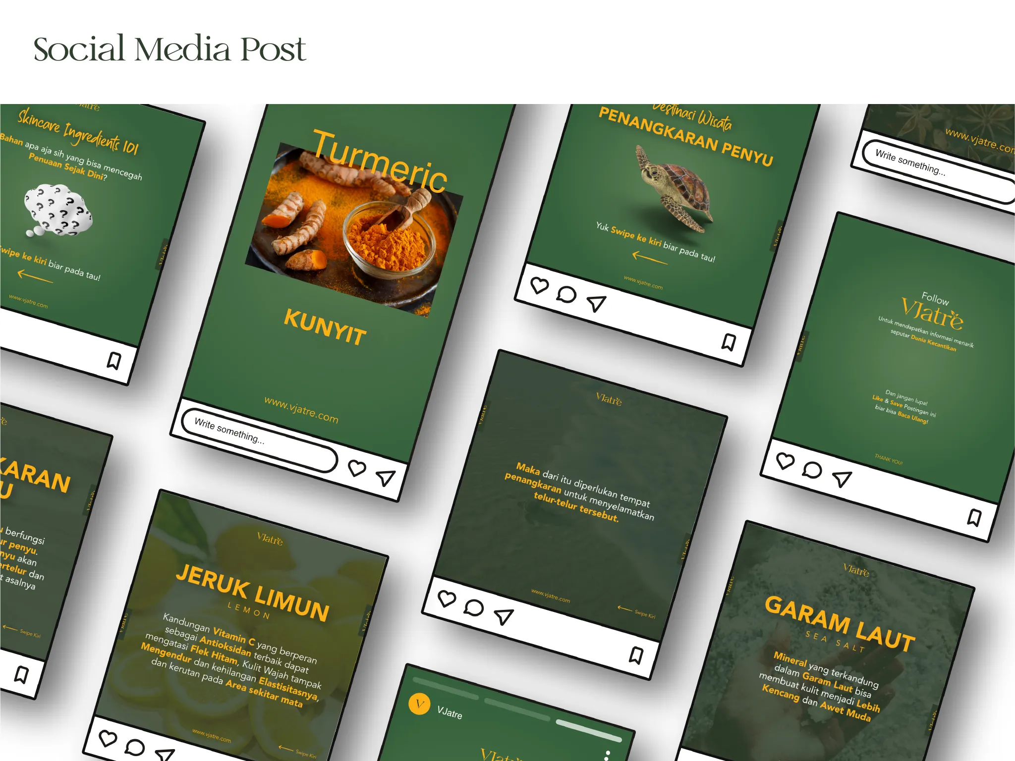
A skincare brand needs to look consistent on a shelf, on a phone, and in a feed. VJatre got a primary and secondary logo plus two alternates, a matching icon set, a pattern, and a social template system built on the same four colours.
- Industry
- Skincare
- Role
- Brand Designer
- Duration
- Jan - Apr 2022, 4 months
- Client
- Backslash Creative Nusantara, for Vjatre
The problem
A skincare brand has to hold in three places at once: a shelf, a phone, and a feed. And nearly every skincare label is competing over the same mint palette.
The work
Four marks, four icons
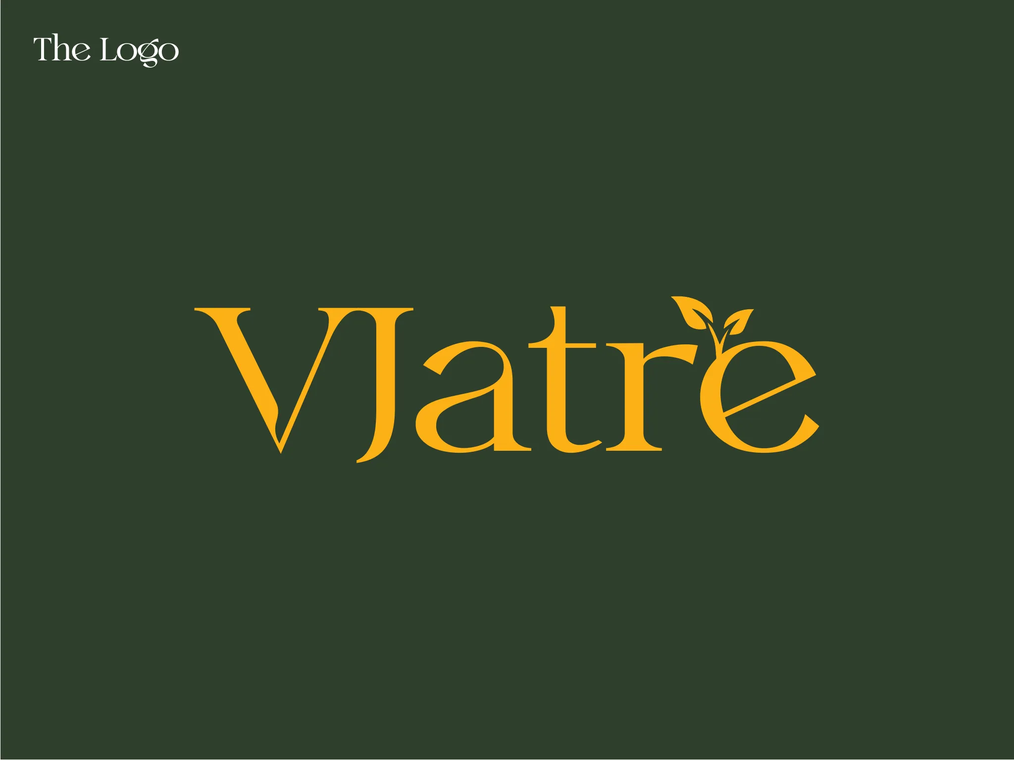
Primary, secondary, and two alternates, each with a matching single letter icon. The alternates exist so the brand never has to be squeezed or recoloured badly to fit a placement.
Green and gold
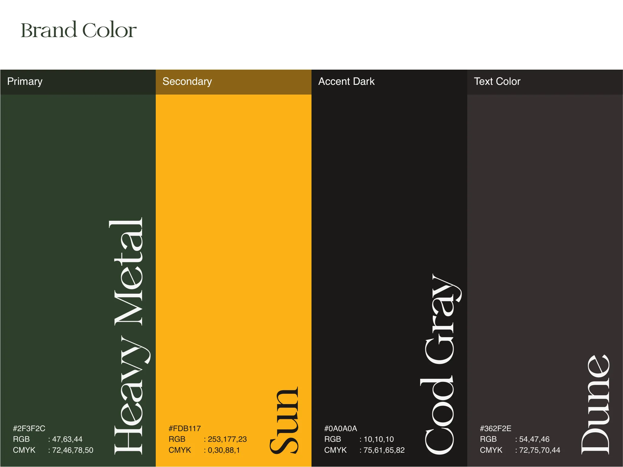
A deep muted green as the base with a warm amber accent, kept away from the fresh mint palette every other skincare label reaches for.
Palette
- Heavy Metal#2F3F2C
- Sun#FDB117
- Dune#362F2E
- Cod Gray#0A0A0A
Inside the project
05 plates
01
Logo and icon variants
02
Brand colour
03
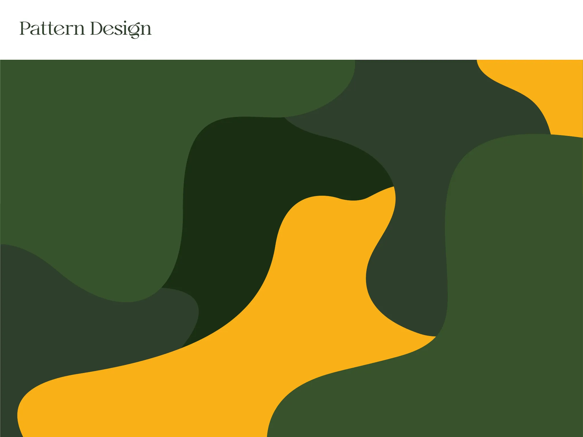
Pattern design
04
Social media posts
05
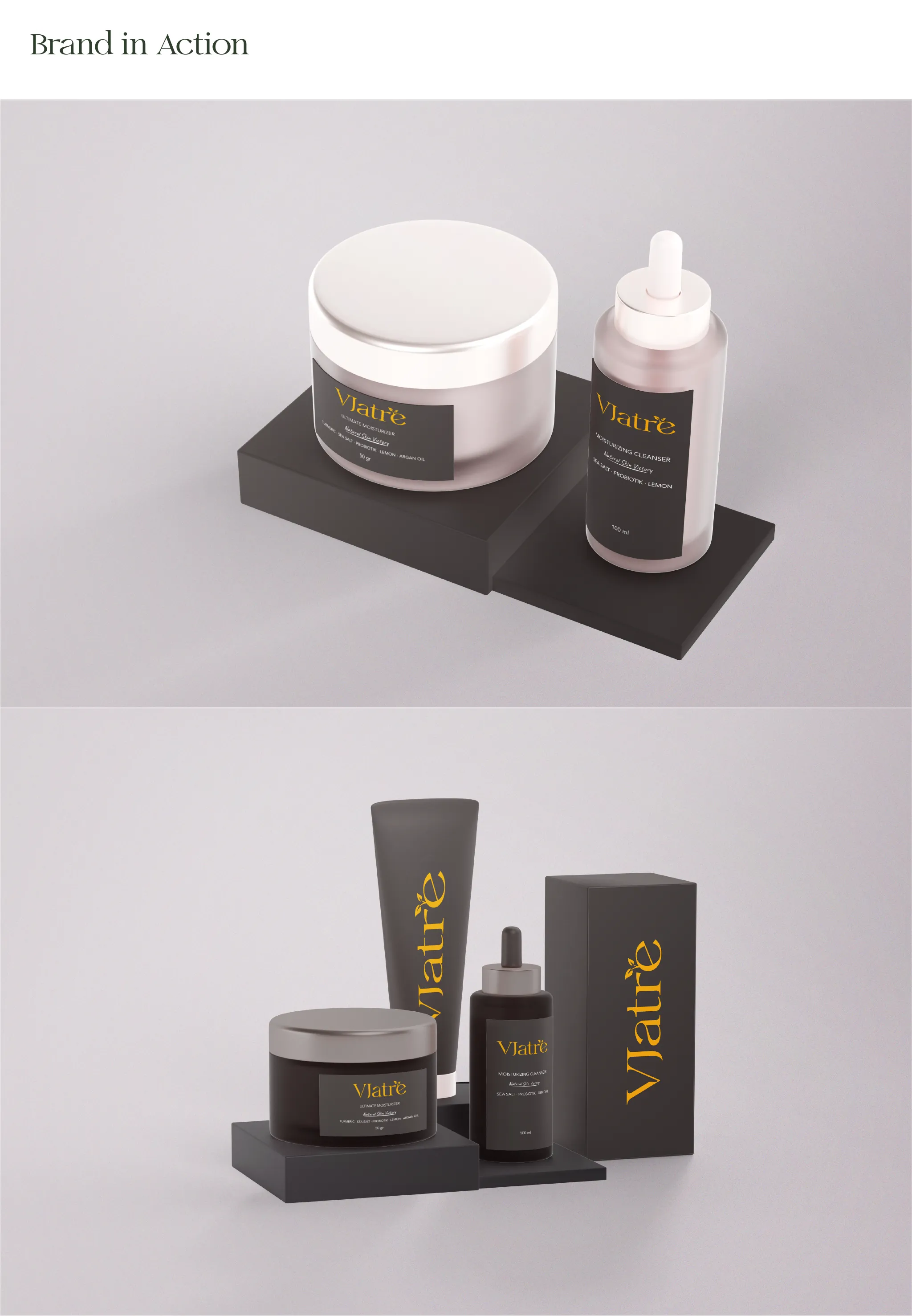
Brand in action