/ Brand identity
Birru.co
A full identity for Birru.co, a speech therapy house for children, taken from the logogram through to the marketplace collateral. The brand ships with its own typeface rather than a licensed one, which is why the wordmark and the interface type feel like the same voice.
- Industry
- Children's health, speech therapy
- Role
- Brand & Graphic Designer
- Duration
- Dec 2023 - Dec 2025, 2 years
- Client
- Birru.co
The problem
Birru.co is a speech therapy house for children, and the people reading its material are parents looking for help for their child. This was a rebrand, so an identity was already running and had to be replaced without making the brand feel like a stranger.
Constraints
- The brand shows up far more often as a social post and a marketplace listing than as a logo.
- The tagline and lockups needed type that could be spaced by eye, not a licensed font to fight against.
The work
A logo system, not a logo
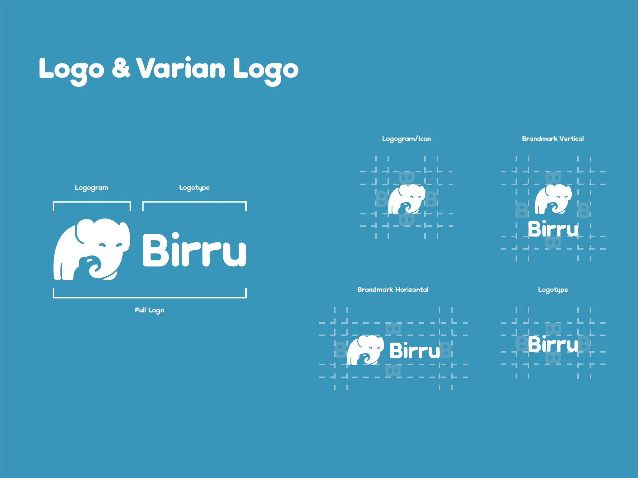
Logogram and icon, logotype, vertical and horizontal brandmarks, and the full lockup. Each one has a job: the icon for an avatar, the horizontal mark for a header, the vertical mark where the space is narrow, the full lockup for print.
Its own typeface
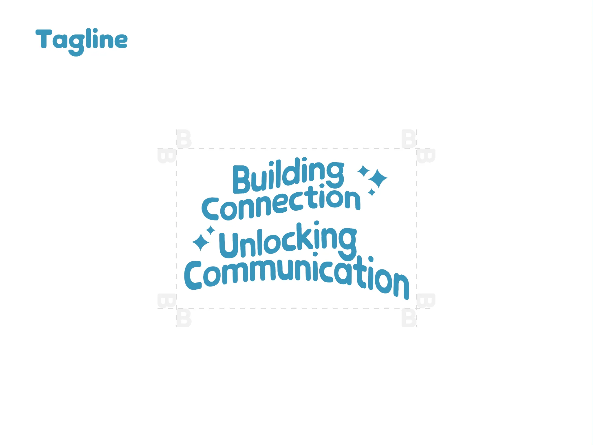
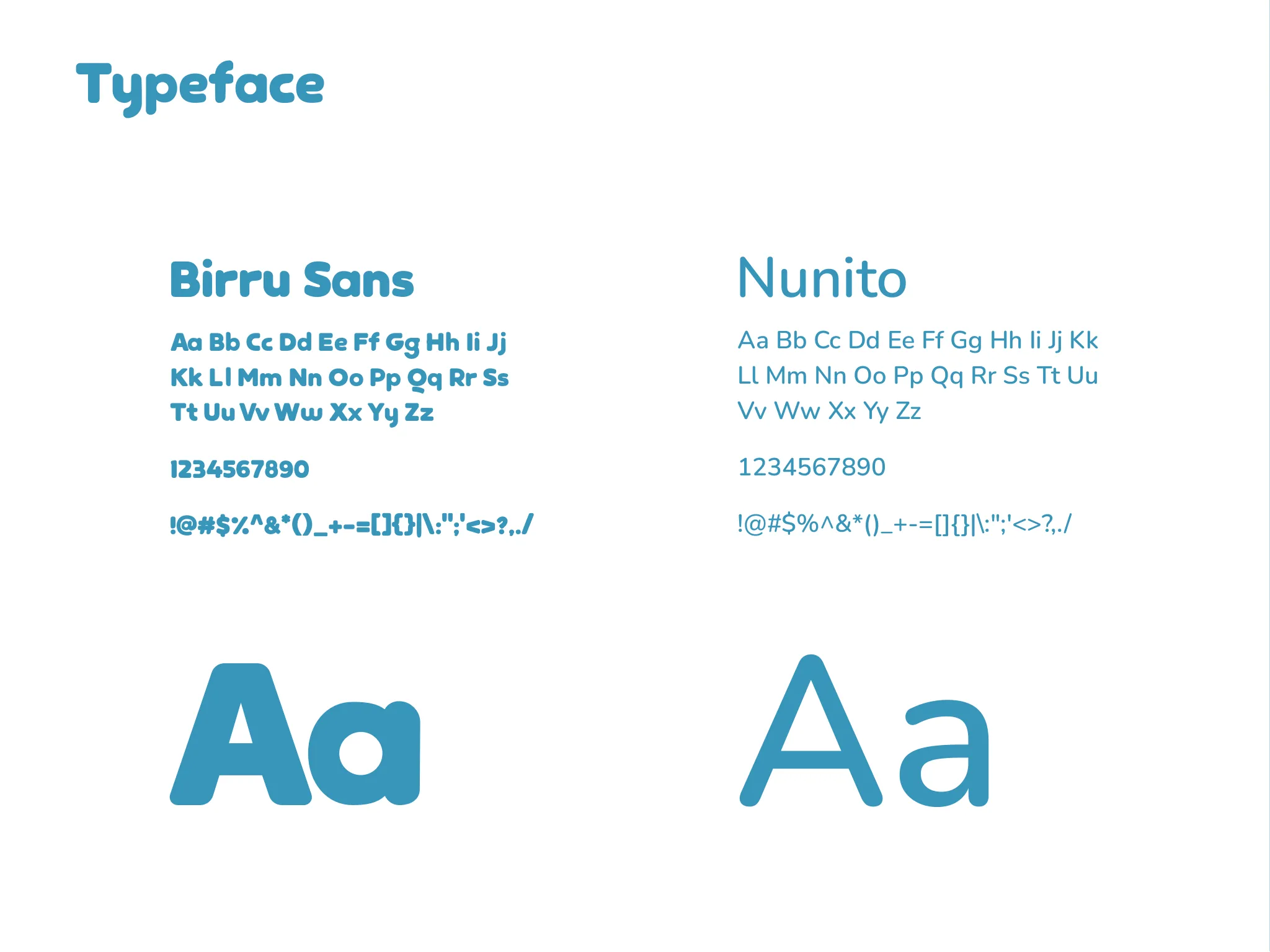
Birru Sans was drawn for this identity and pairs with Nunito for running text. Drawing the display face meant the tagline lockups could be spaced by eye rather than fought against a font that was never meant for them.
Into the wild
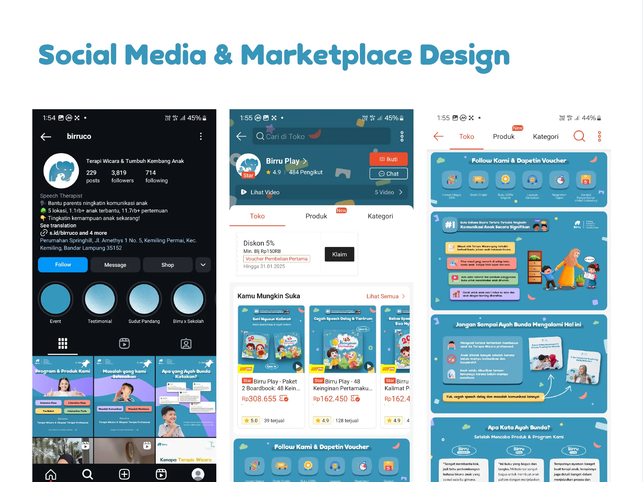
The system was extended to social media and marketplace listing design, which is where most people actually meet the brand.
Typography
- Birru Sans, drawn for the brand
- Nunito
Results
- Birru Sans shipped in twelve styles, six weights each with an italic.
- Brand guidelines were handed over as something the team works from, not just a logo file.
- The system carried into social media and marketplace listings, where the brand is actually met.
Try the typeface
108 glyphs · 12 styles
Speak a little clearer
Speak a little clearer
Speak a little clearer
Speak a little clearer
Speak a little clearer
Speak a little clearer
Speak a little clearer
- Speak a little clearerExtraLight
- Speak a little clearerExtraLight Italic
- Speak a little clearerLight
- Speak a little clearerLight Italic
- Speak a little clearerRegular
- Speak a little clearerRegular Italic
- Speak a little clearerSemiBold
- Speak a little clearerSemiBold Italic
- Speak a little clearerBold
- Speak a little clearerBold Italic
- Speak a little clearerExtraBold
- Speak a little clearerExtraBold Italic
Character set
- !
- "
- #
- $
- %
- &
- '
- (
- )
- *
- +
- ,
- -
- .
- /
- 0
- 1
- 2
- 3
- 4
- 5
- 6
- 7
- 8
- 9
- :
- ;
- <
- =
- >
- ?
- @
- A
- B
- C
- D
- E
- F
- G
- H
- I
- J
- K
- L
- M
- N
- O
- P
- Q
- R
- S
- T
- U
- V
- W
- X
- Y
- Z
- [
- \
- ]
- ^
- _
- `
- a
- b
- c
- d
- e
- f
- g
- h
- i
- j
- k
- l
- m
- n
- o
- p
- q
- r
- s
- t
- u
- v
- w
- x
- y
- z
- {
- |
- }
- ~
- ©
- ®
- °
- ±
- ×
- ÷
Inside the project
04 plates
01
Logo and brandmark variants
02
Tagline lockups
03
Birru Sans against Nunito
04
Social media and marketplace design